Wecheer.io
Client: Wecheer.io
Project: Redesign Smart Bottle Opener Packaging
Scope of Work: Packaging Design
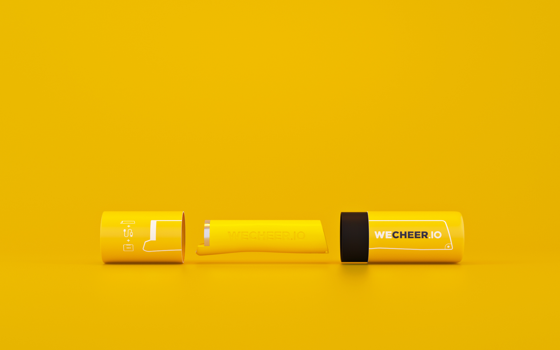
Back in 2018, Wecheer.io was a company that for the first time, I used 3D to execute my tasks together with skills in graphic design.
Wecheer.io owns an innovation that creates immense shared value for beverage companies, bars, and consumers alike. Using Image Recognition and IoT Technology, their Patented Smart Bottle Opener can instantly identify the user, time, location and brand of any crown capped bottle while it’s being opened! For the first time in the mass packaged goods industry, a physical consumption moment is digitally captured, giving beverage companies a unique access to real-time market intelligence and direct user engagement opportunity.
I was assigned to redesign the packaging of the bottle opener using whatever I was able to do, 2D as usual is fine, if I could do it in 3D, that would be great. The team told me so. I decided it was the time to change my career forever with 3D. Why not? I could see many benefits from using 3D in this project.
Project’s goal is to change the shape of previous packaging which was a rectangular thick paper like an iphone box (totally the same). For two reasons. The “iphone box” packaging was expensive and heavy. The other reason was to reduce useless/empty volume inside the box. My challenge was to reduce production cost of packaging, “half of the old one” price they said.
Back then, I thought the solution simply was to reduce the useless/empty volume as much as I could. I started to look at our bottle opener. Suprisingly, it was created with a cylinder shape. Then boom, why not using also a cylinder shape packaging?
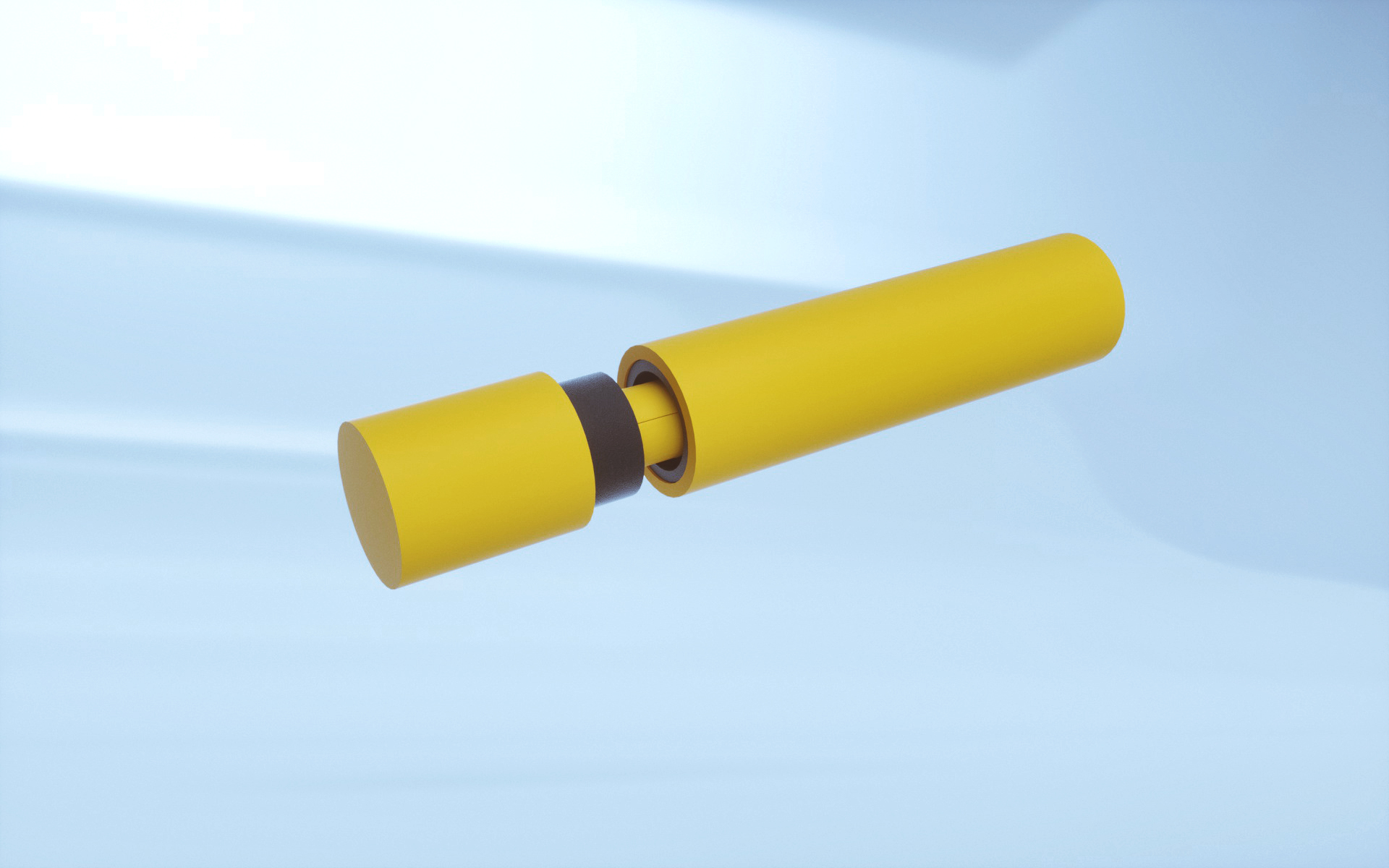
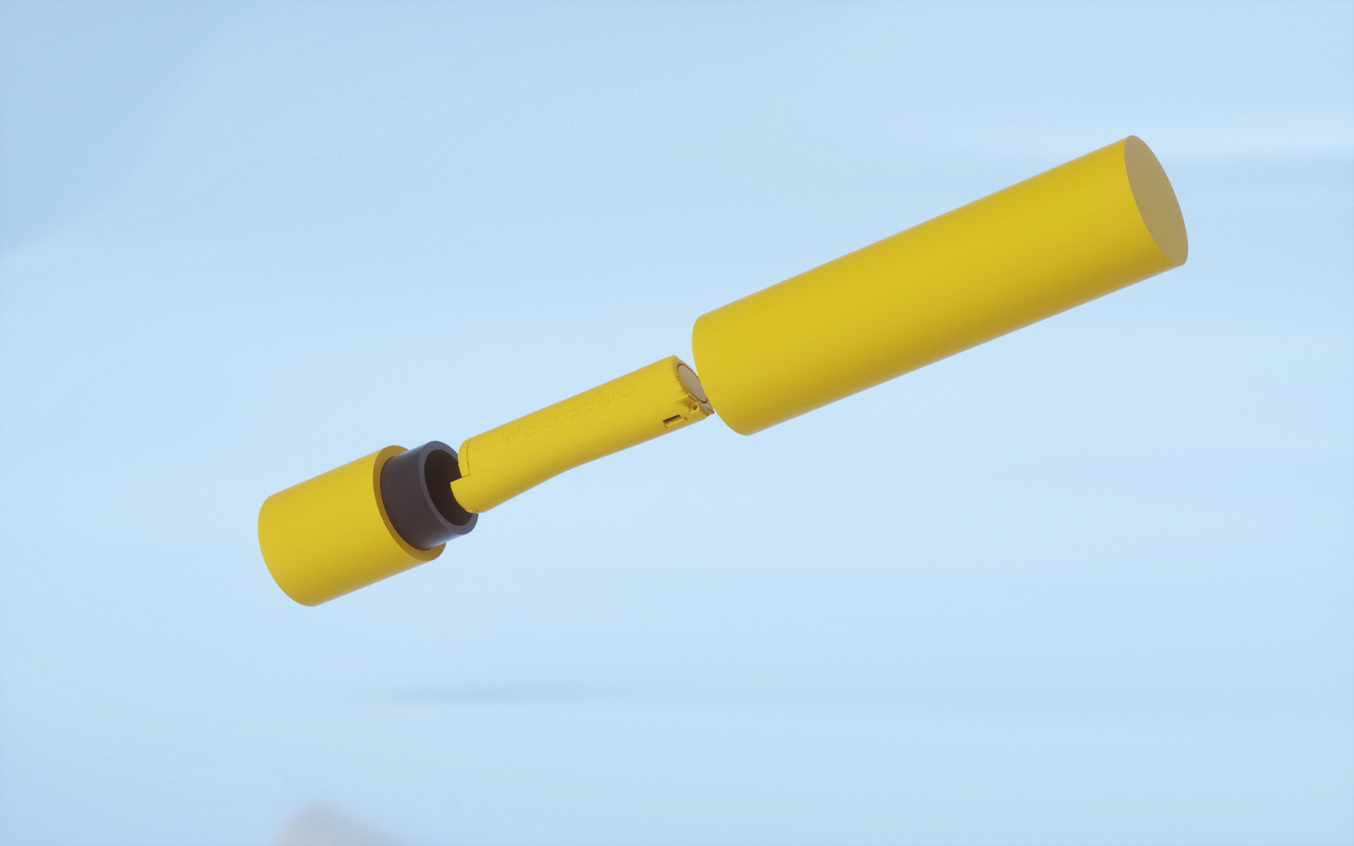
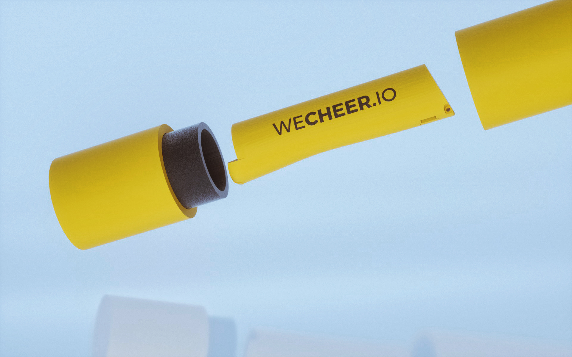
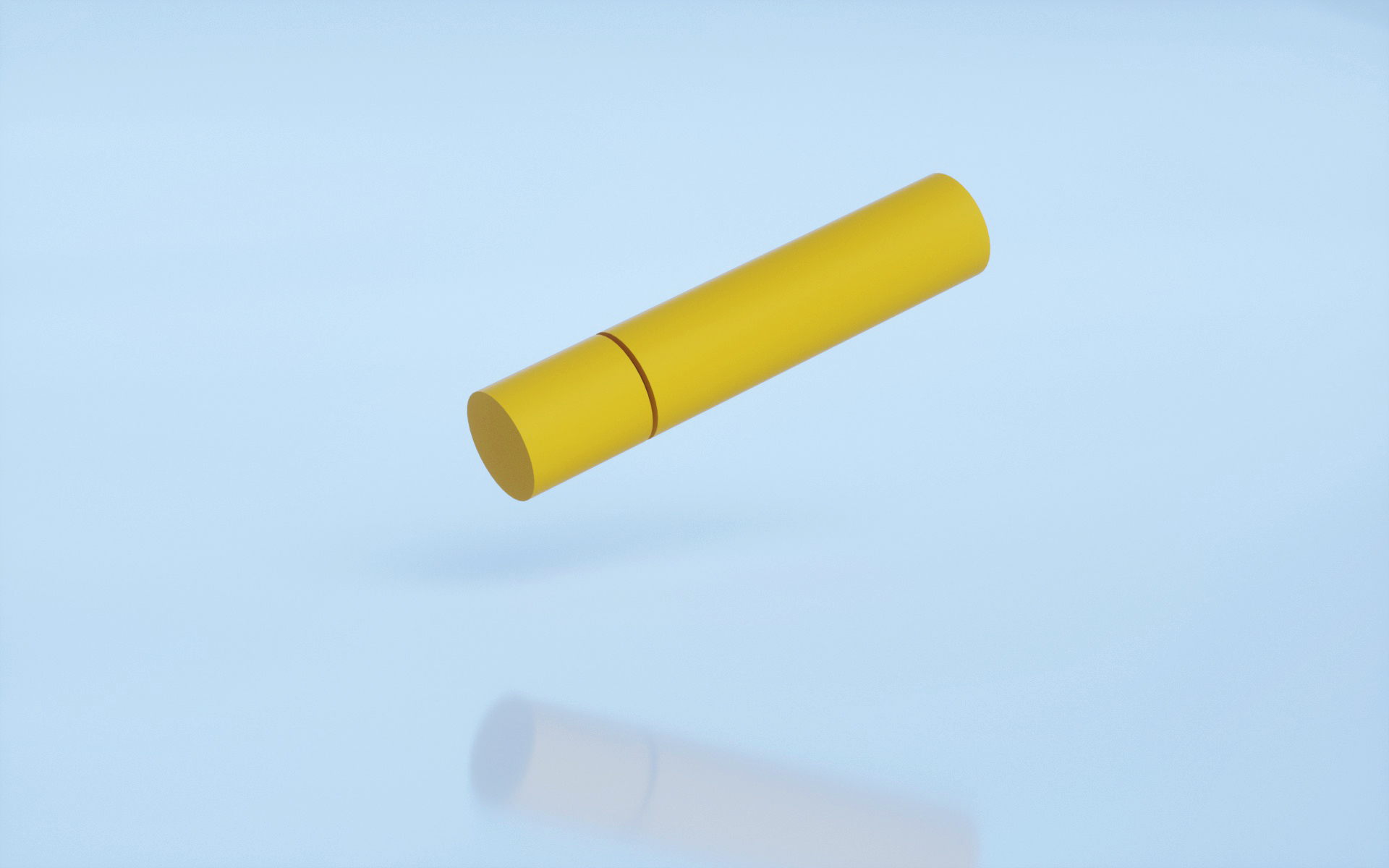
First-ever renders of 3D packaging for Wecheer.io Smart Bottle Opener on 10th October, 2018
It was the first time we applied this kind of process in working with packaging design. I started with 2D in Adobe Illustrator to briefly present my solution for the packaging. The team was happy with my cylinder solution created by some graphic tricks I used to illustrate fake 3D in 2D environment. Then it was the time for 3D. I modeled the shape, put it in a light scene then voila, the team did not need to imagine the result from 2D drawing.
Then, after we got the final approval from the BOD for the shape of new packaging, how about design? I came up with three concepts.
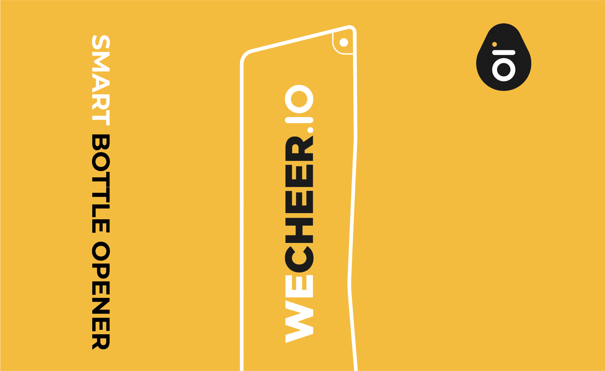

First graphic concept for the sleeve on 13th November, 2018
With the first concept, I liked to start with minimalism design, just like the art style of previous packaging but with my personal touch. Simple but effective display of smart bottle opener.

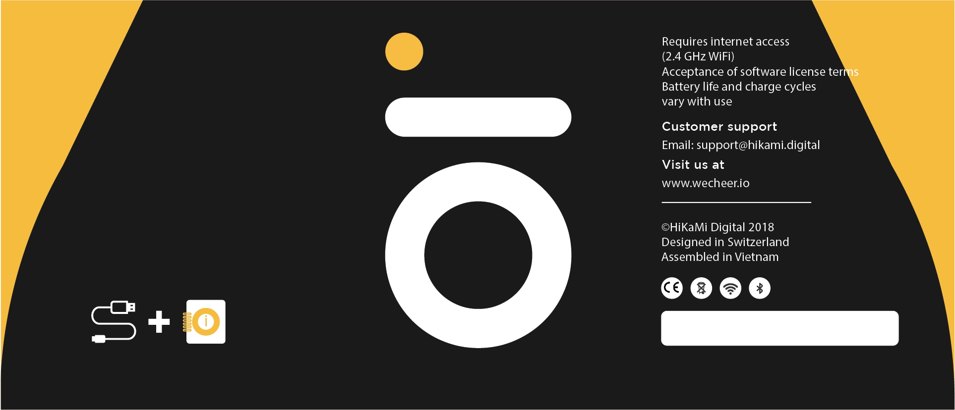
Second graphic concept for the sleeve on 13th November, 2018
For second concept, I wanted to play it bold, impressive big logo as the main factor in the design. The problem with this option was it did not illustrate our product well enough. But I thought it was more fun than the first option.
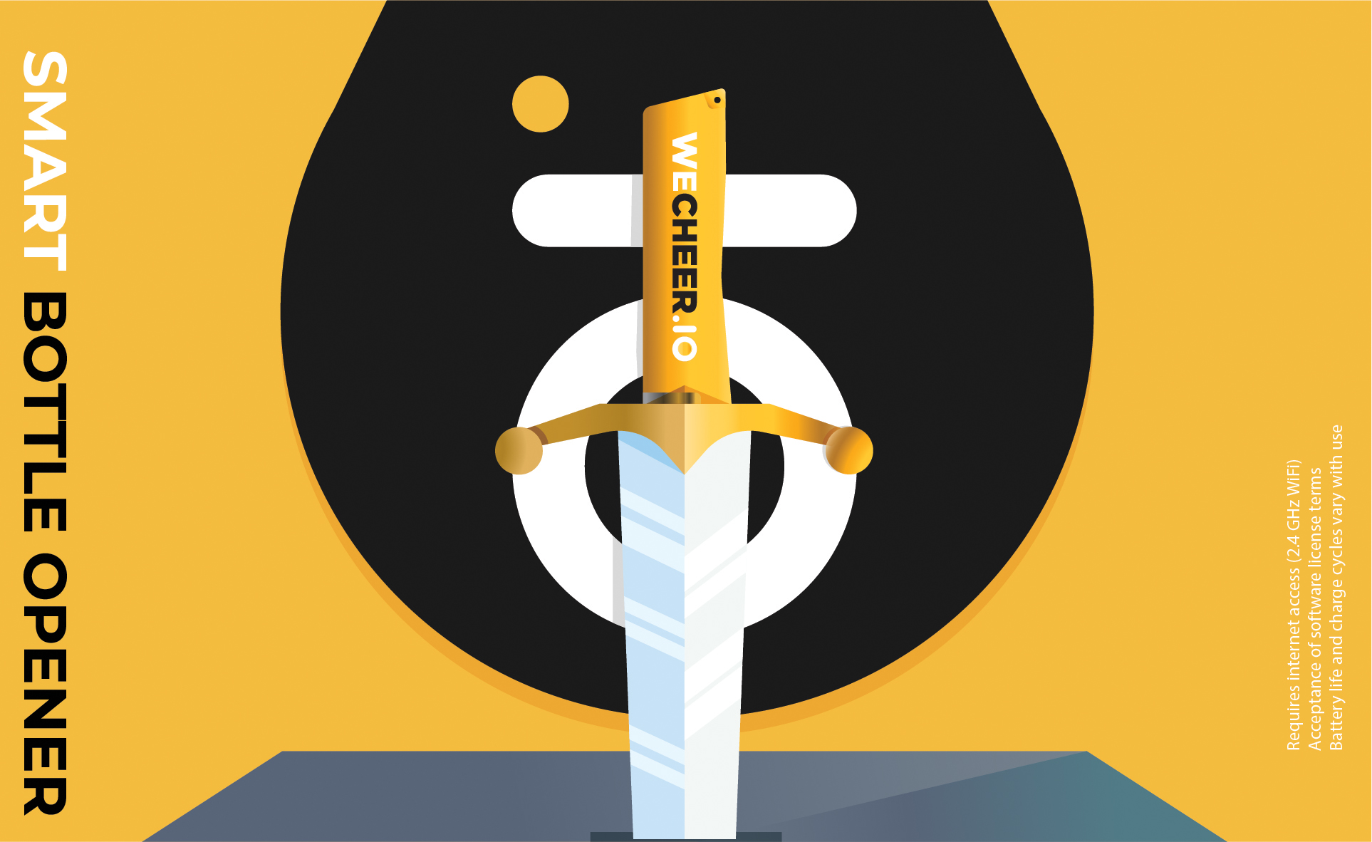
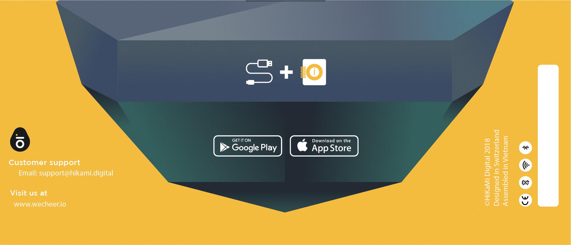
Third graphic concept for the sleeve on 13th November, 2018
For last option, I was inspired by the story of King Arthur because someone in the team said our bottle opener was like a holy weapon for user. That’s funny to hear that and to create this design.
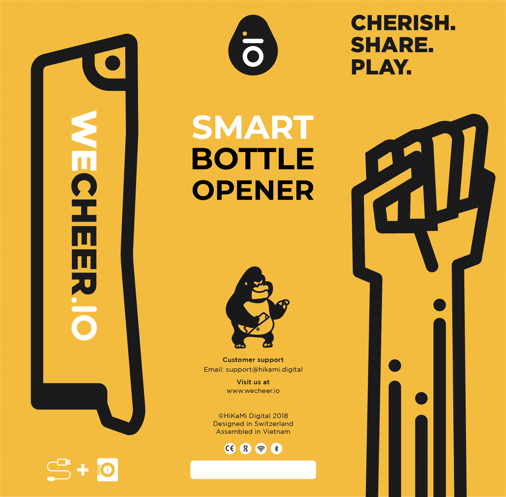
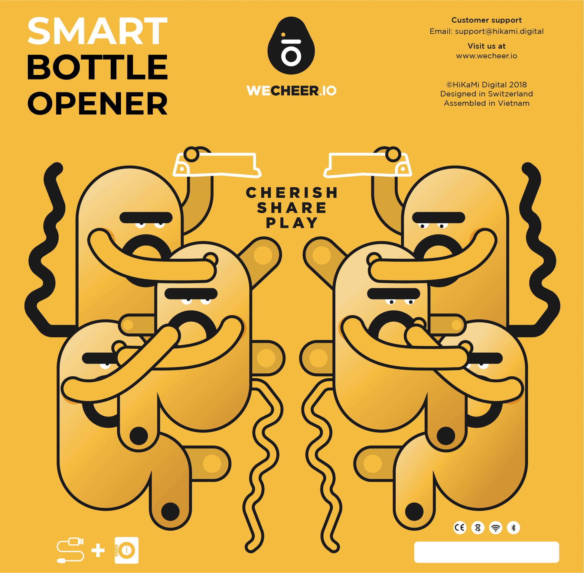
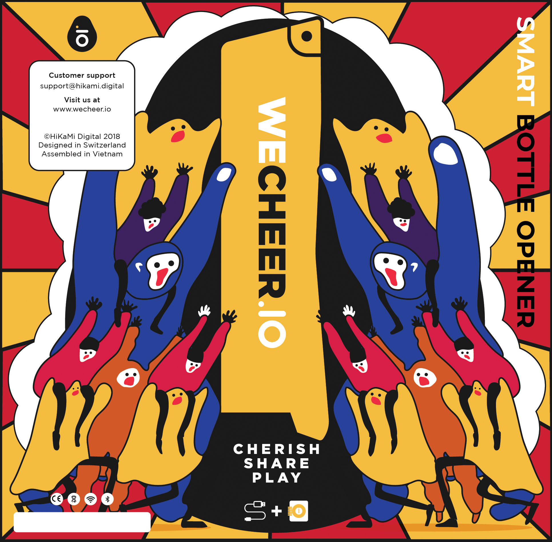
Some extra graphic concepts for the sleeve on 20th November, 2018
I even went further with some crazy designs. But I thought they were just too much. After having some designs, I transfer those to 3D environment to apply them on my 3D model and wait to see the magic. The team was super excited with my proposal. It was easy for them to see real things rather than imagination from 2D drawings.
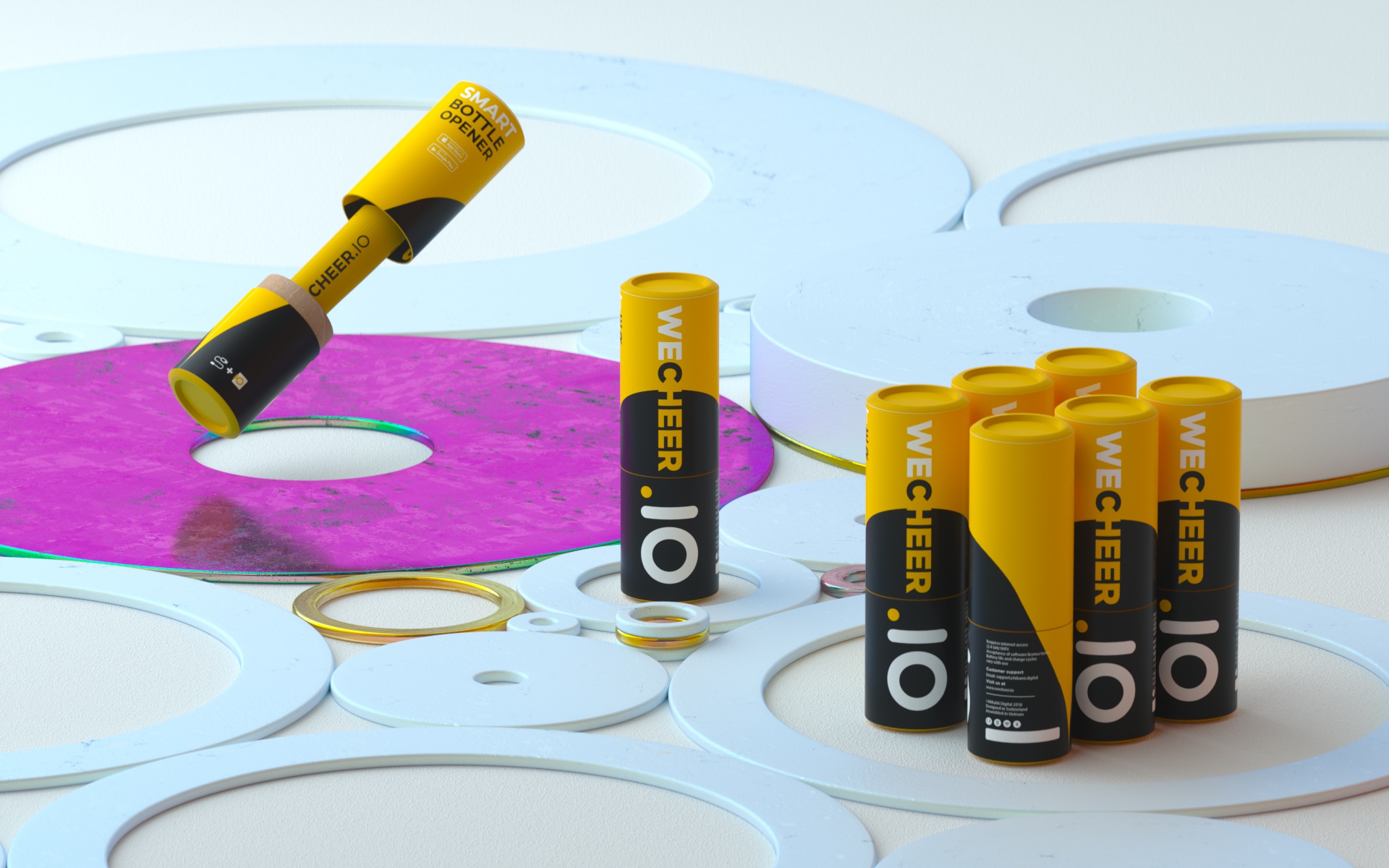

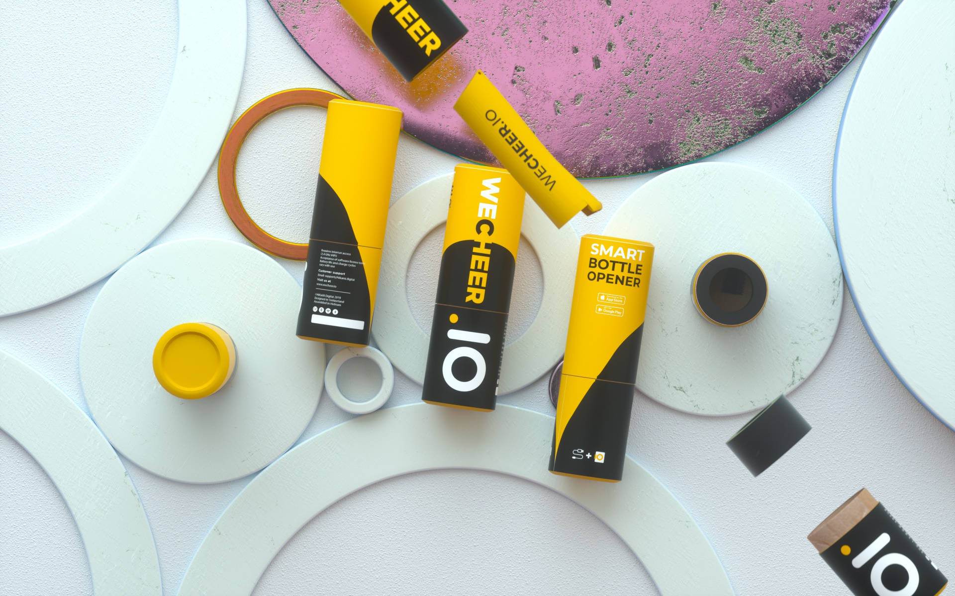
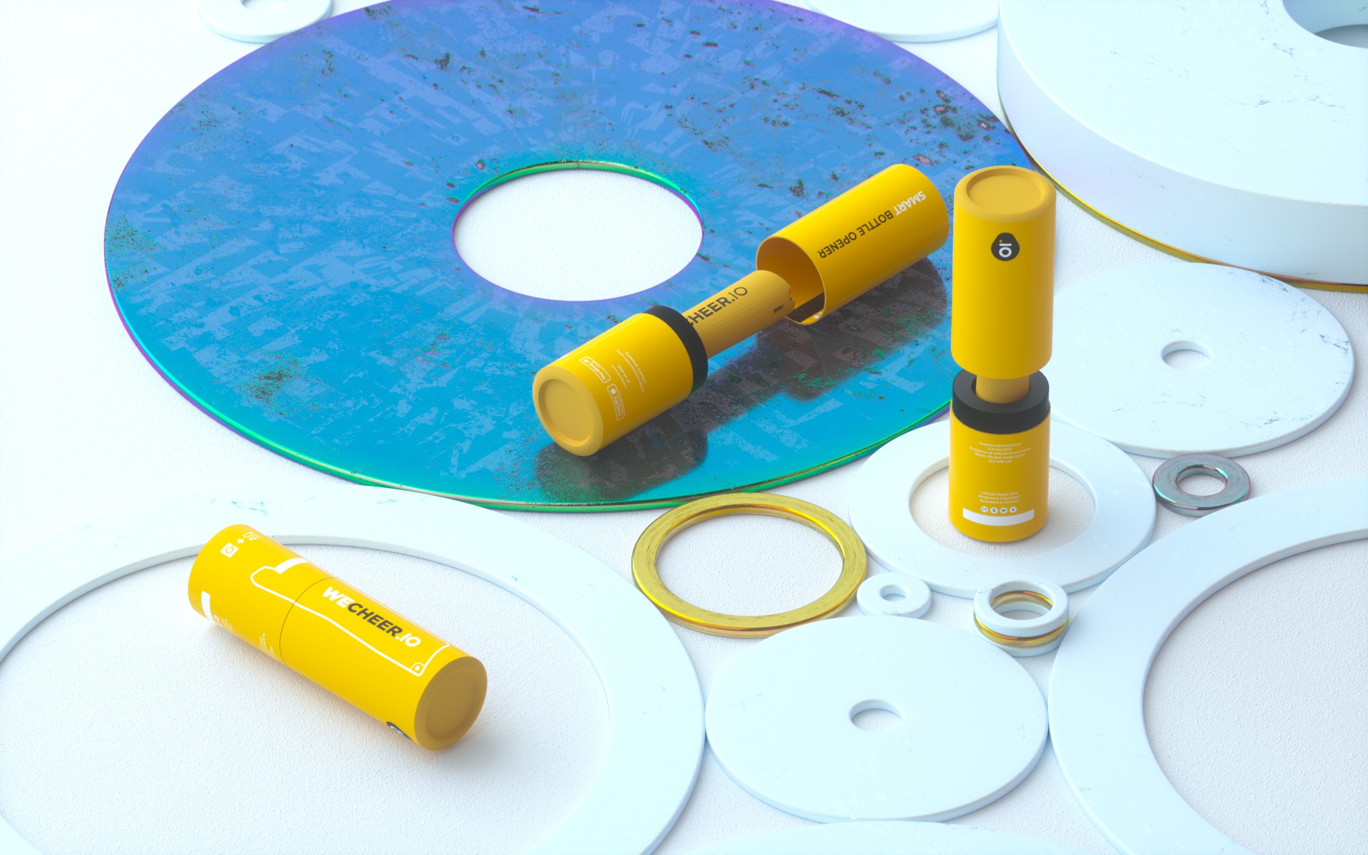

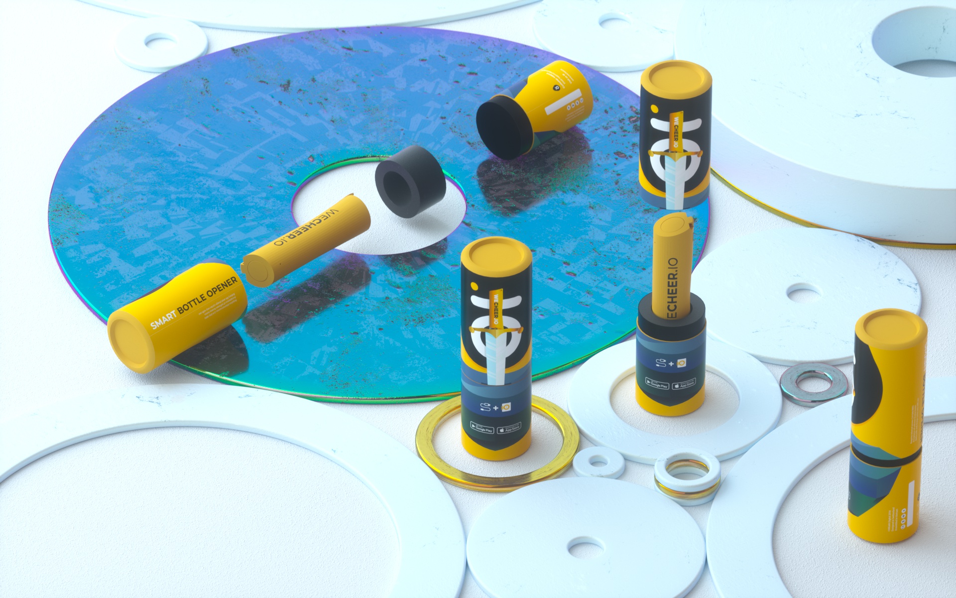

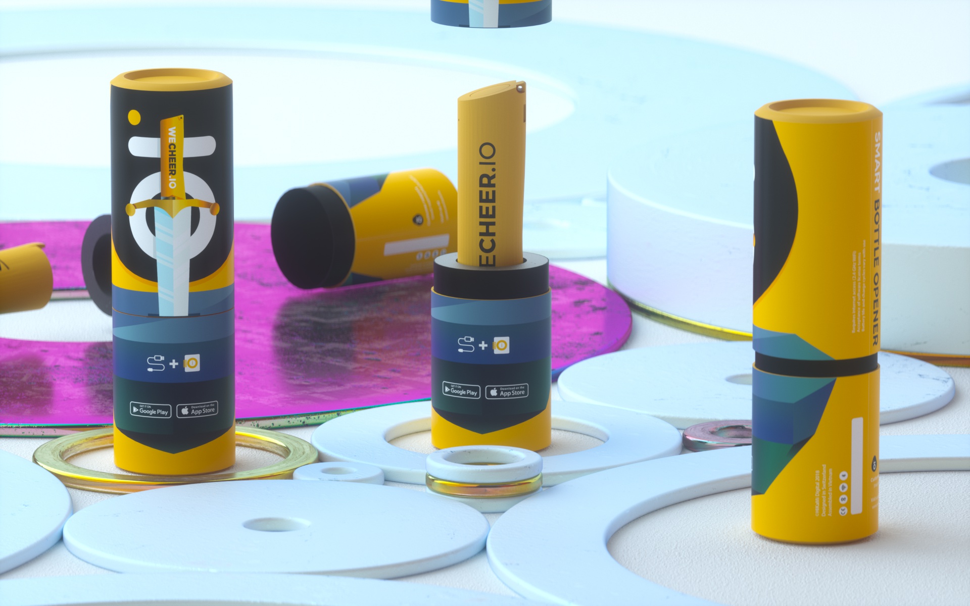
It was quite easy for the team to see which options really work here.
After all, I got the final approval for my design which was based on my first option. I improved the design a bit with bold characteristic and tried to locate all the information text on one side. The other side was just focusing on graphic.
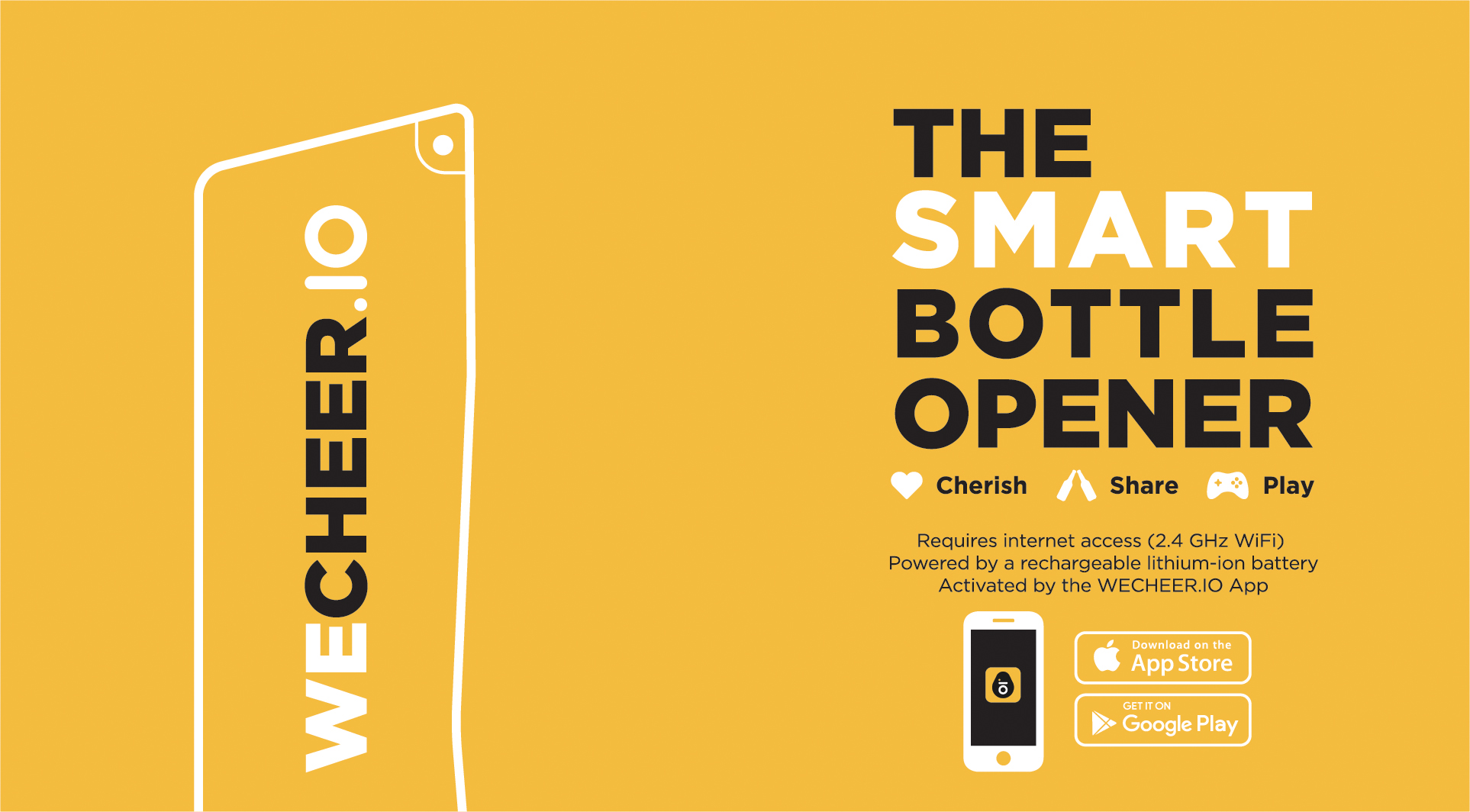
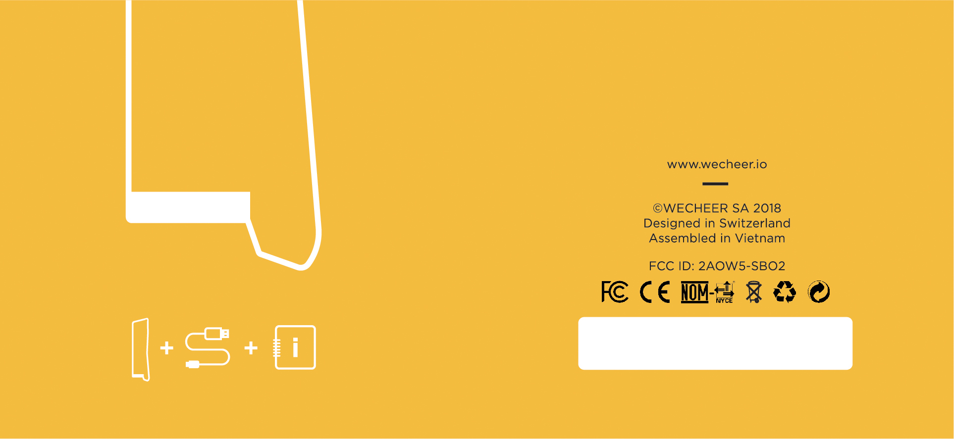
Final design approved on 25th November, 2018
Next few days, I only played around with the final design with 3D to see the possibility of doing the work by this tool.
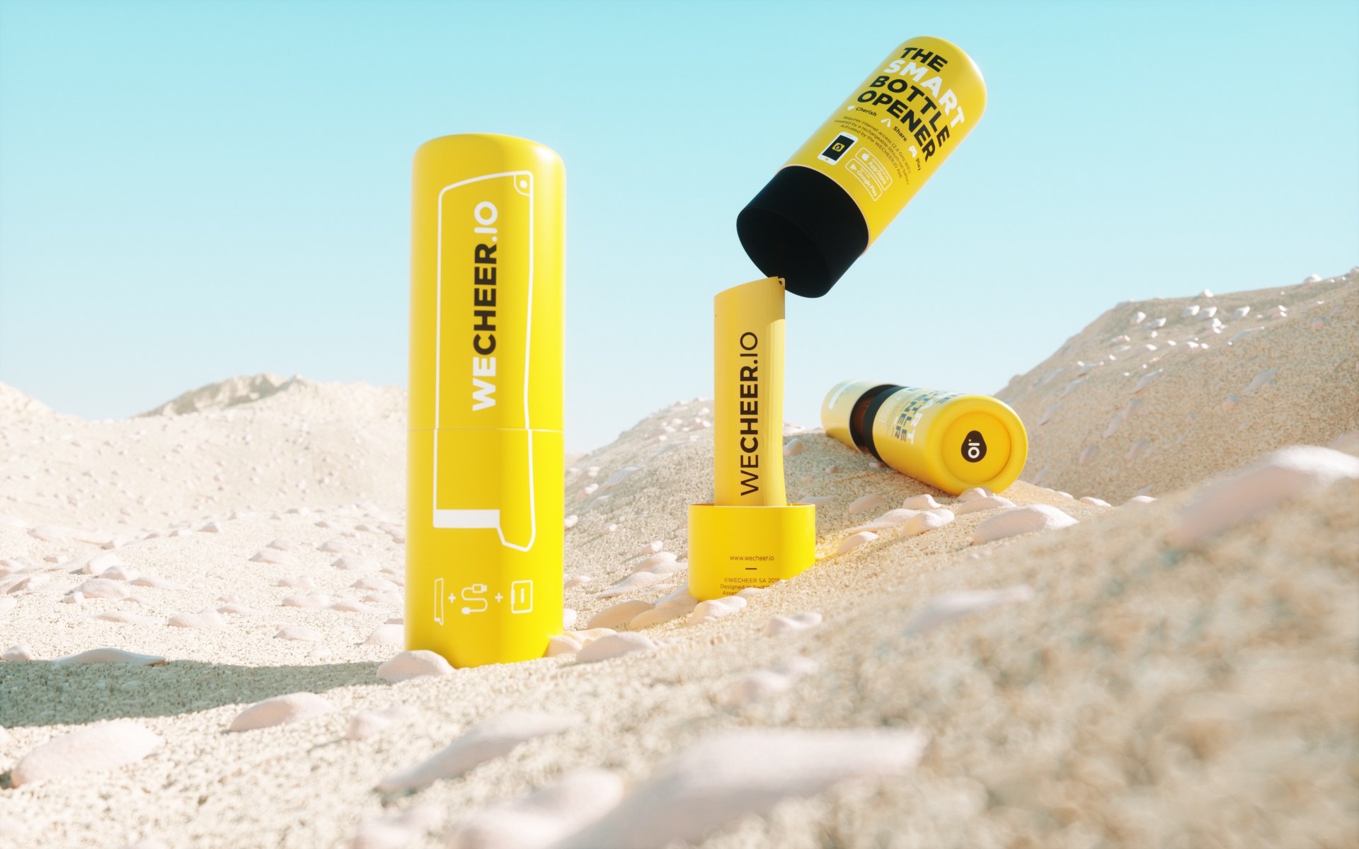

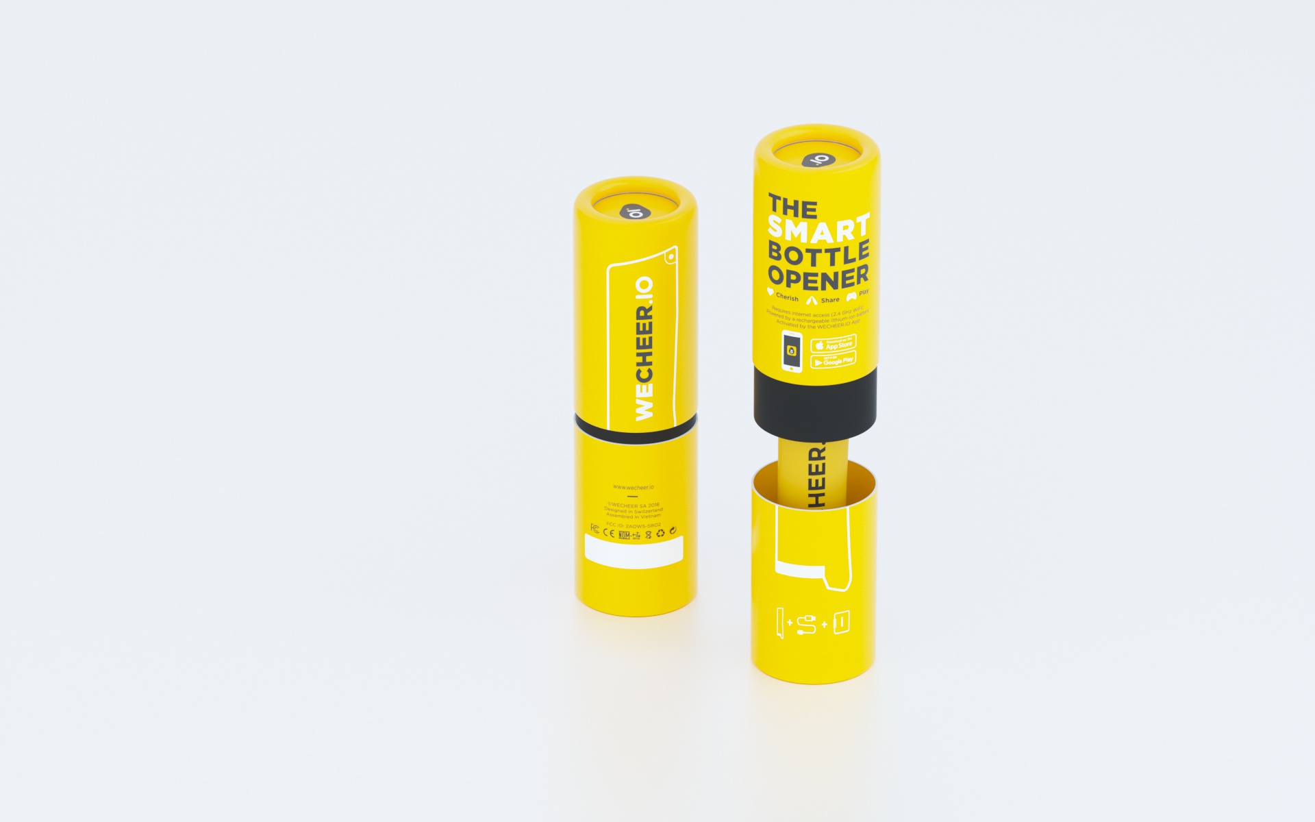
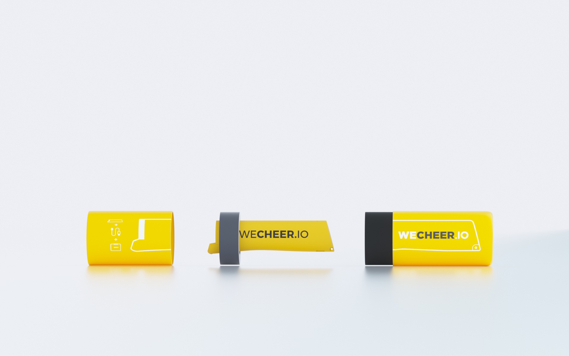
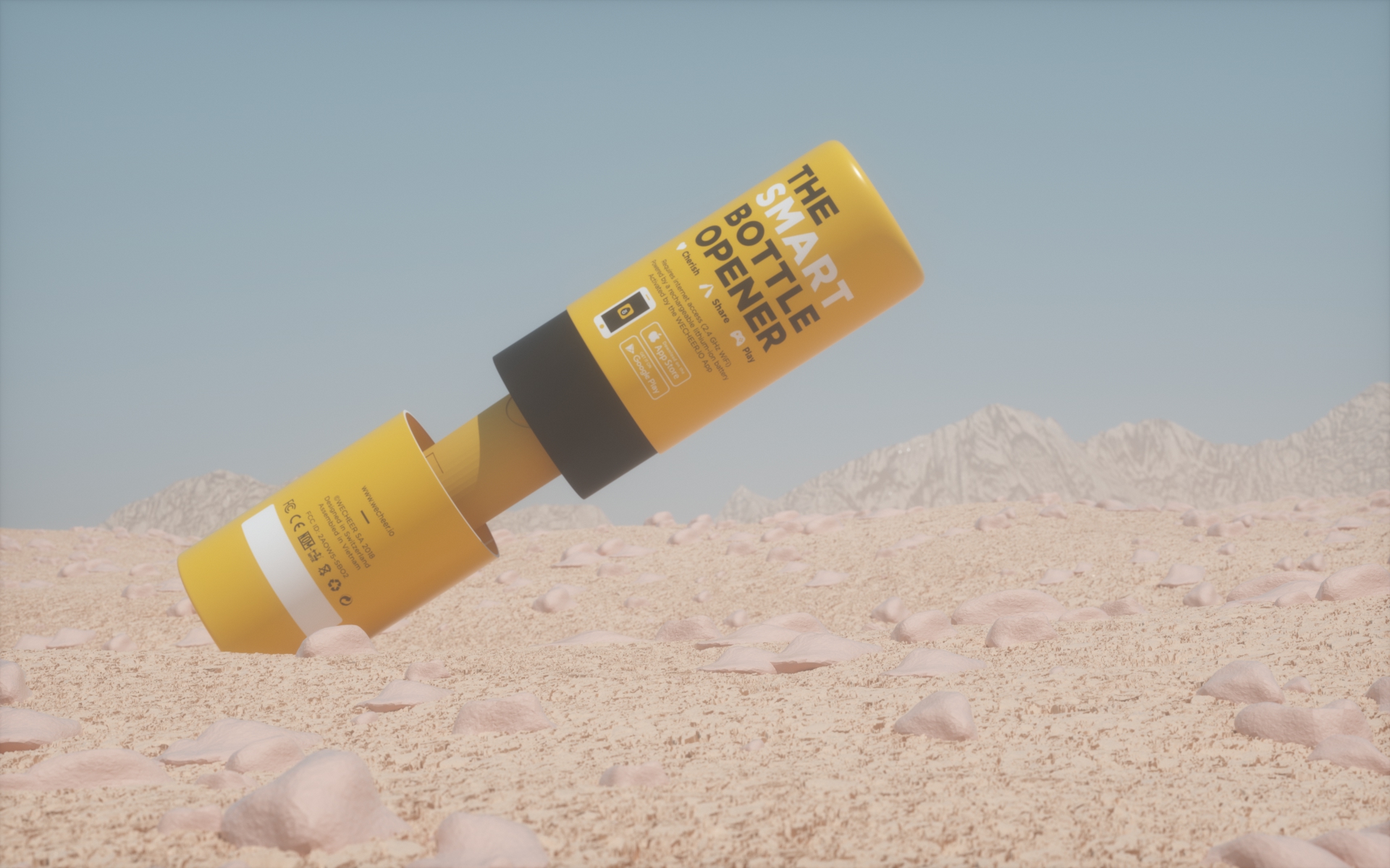

Some more renders with final design
![]()
![]()
![]()
![]()
![]()
![]()
![]()
![]()
Finally, we agreed to produce this option. Simpler and cheaper than first one. That’s all for my very first 3D packaging project.
First product animation on 27th November, 2018
What did I achieve during this project? With my design, I was able to reduce our production cost 4 times (from 50.000VND to 12.000VND), way better than what my team expected. The new design also had less empty volume than the old one.
![]()
![]()
![]()
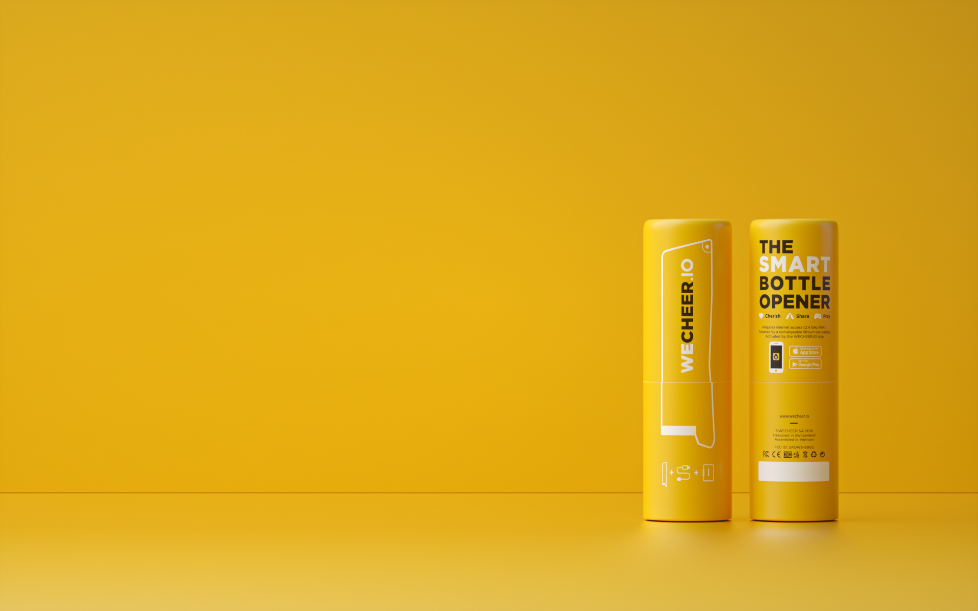
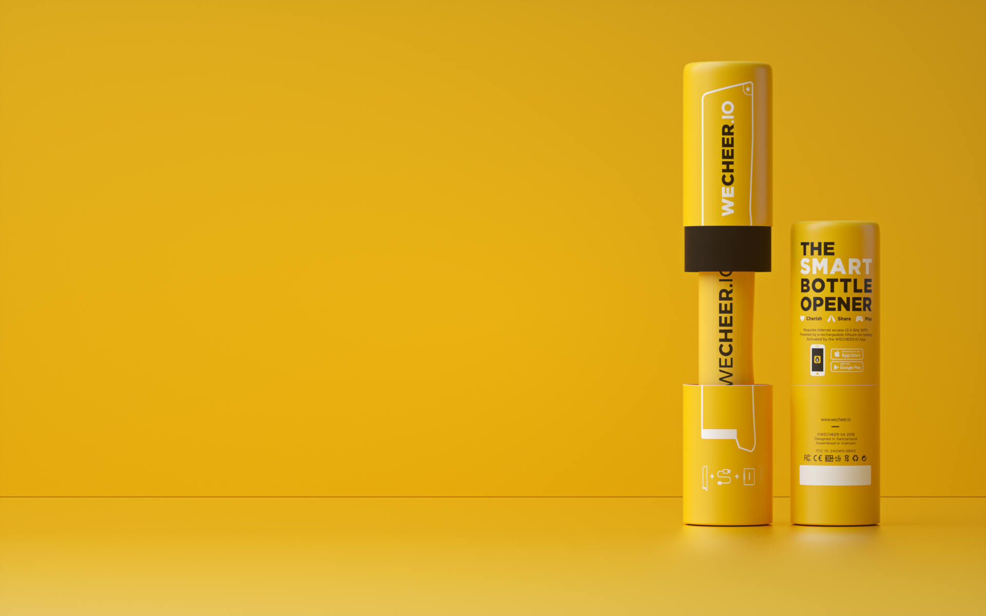
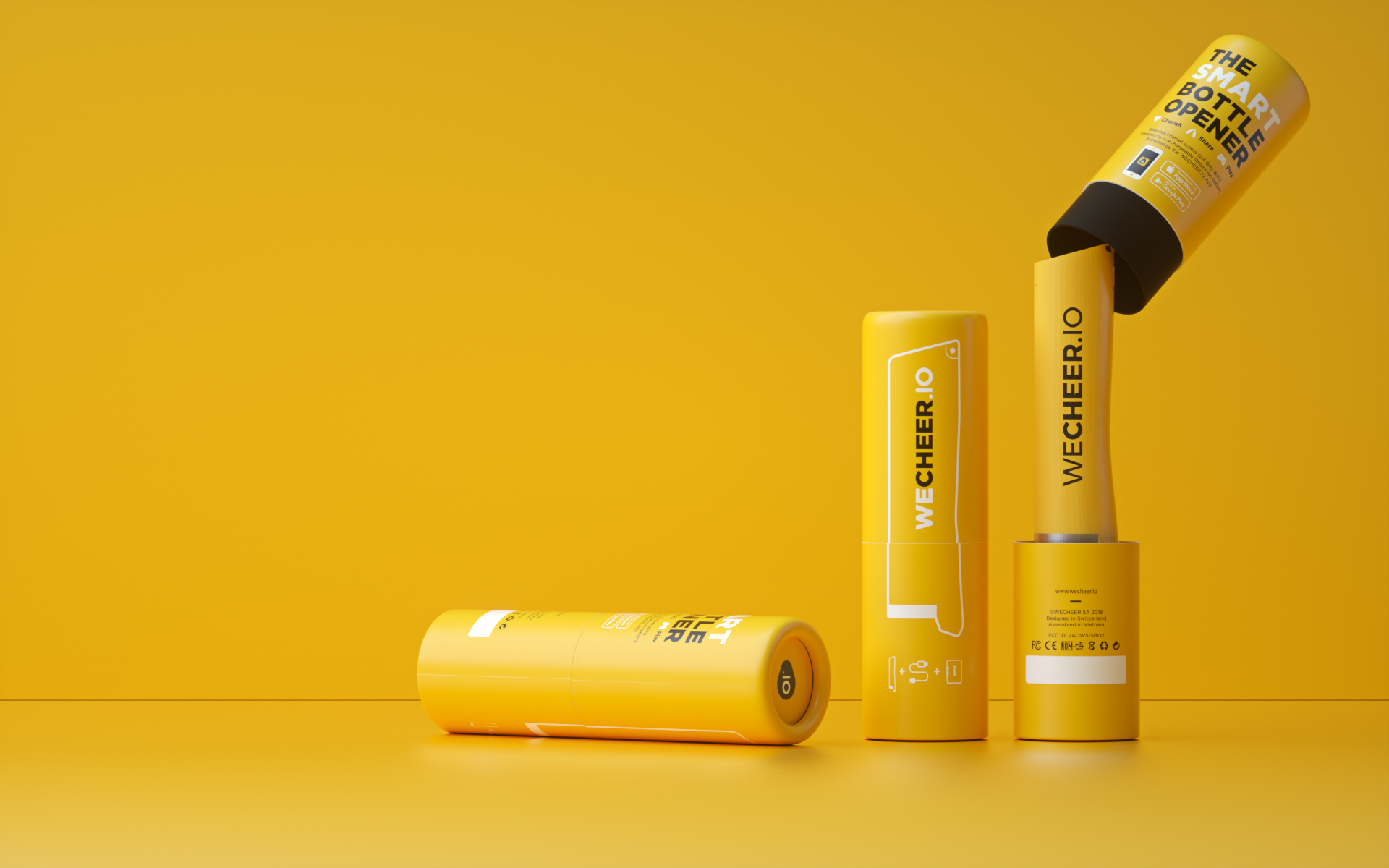
Renders for website, 04th January, 2019
One month later, I was asked to create some more renders for website illustration of our smart bottle opener. The website was likely minimalism design with solid yellow. This time, I tried to set up a scene with yellow environment and placing our products inside.
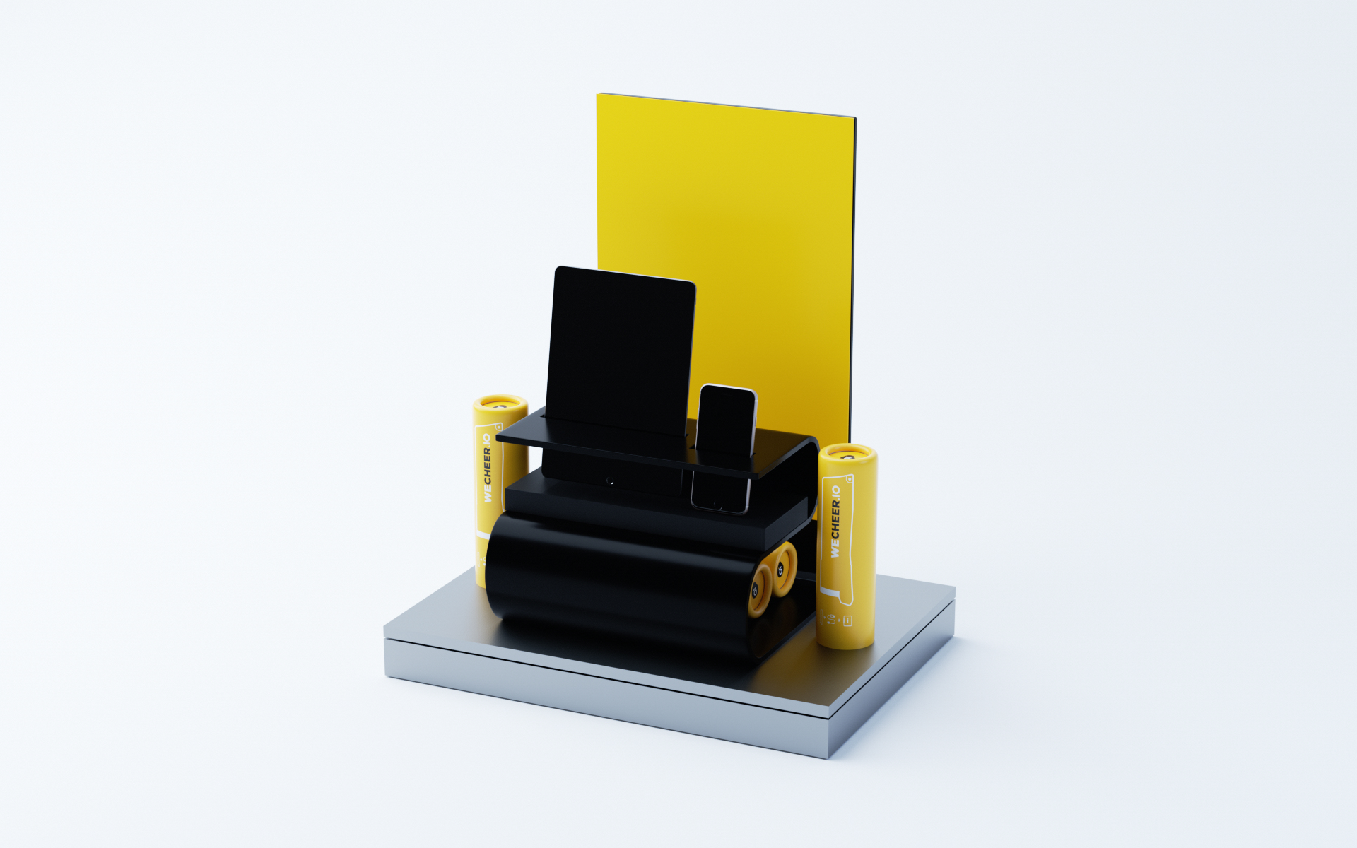
Then, we had an international exhibition to join with our smart bottle opener. Karim, the CEO, wanted me to design a stand case for illustrating our product together with some smart devices to quickly present our SBO fuctions.
Then, we had an international exhibition to join with our smart bottle opener. Karim, the CEO, wanted me to design a stand case for illustrating our product together with some smart devices to quickly present our SBO fuctions.
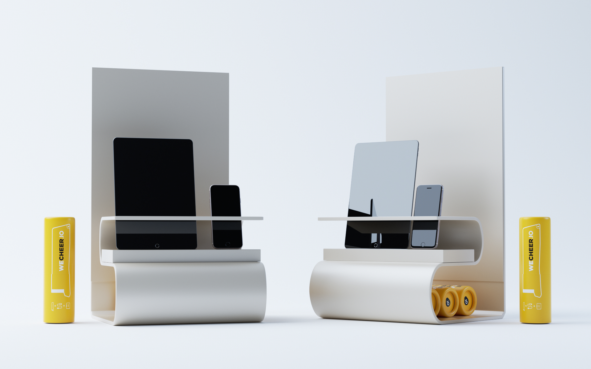
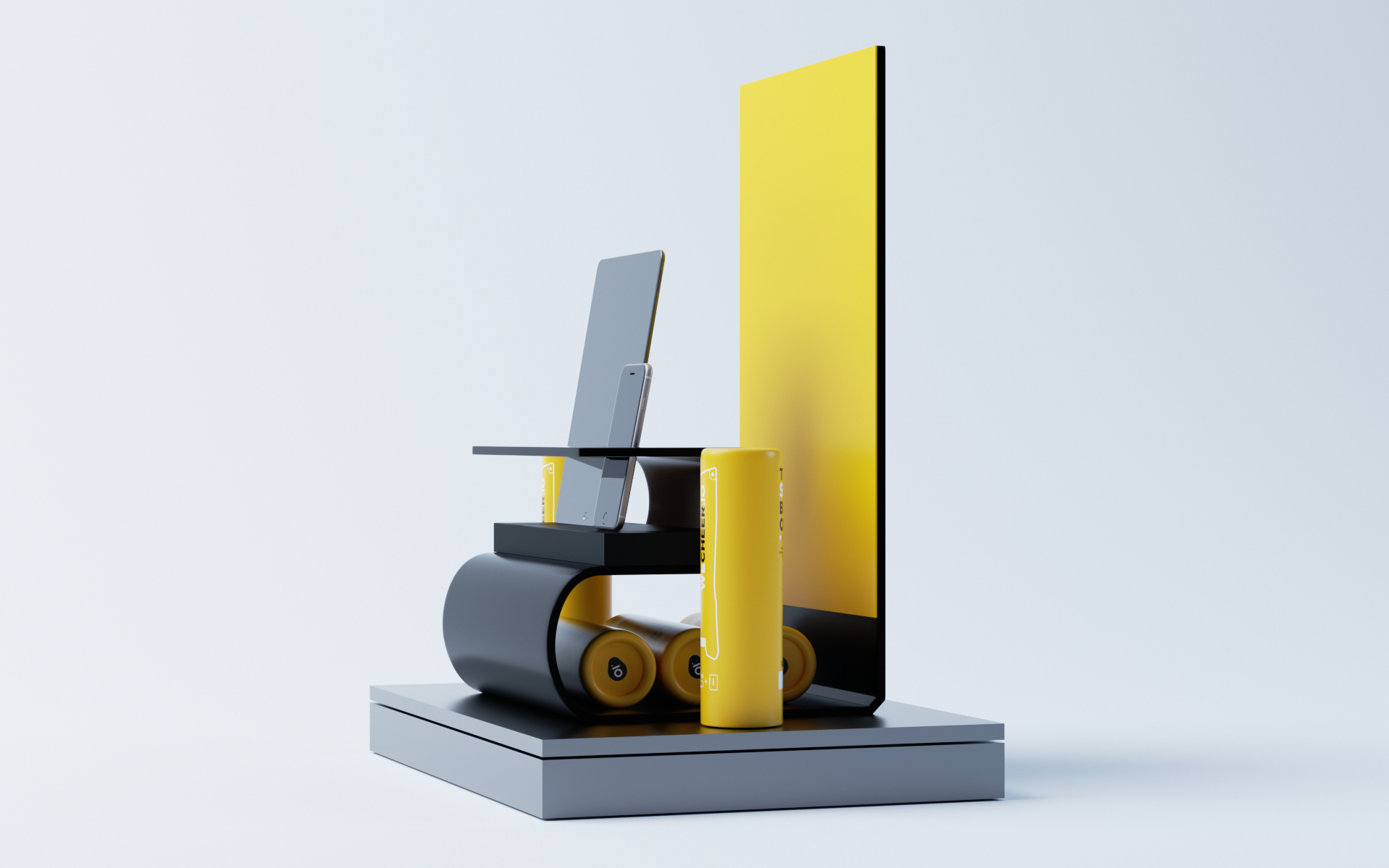
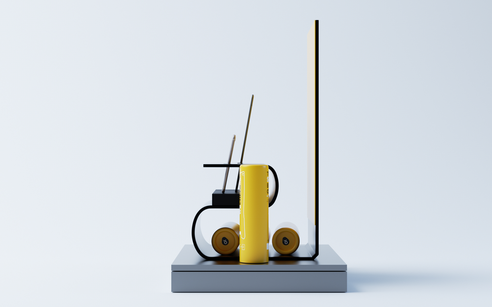
Stand case first design on 04th June, 2019
For this option, it was quite difficult to produce. We did not have time back then for production either.
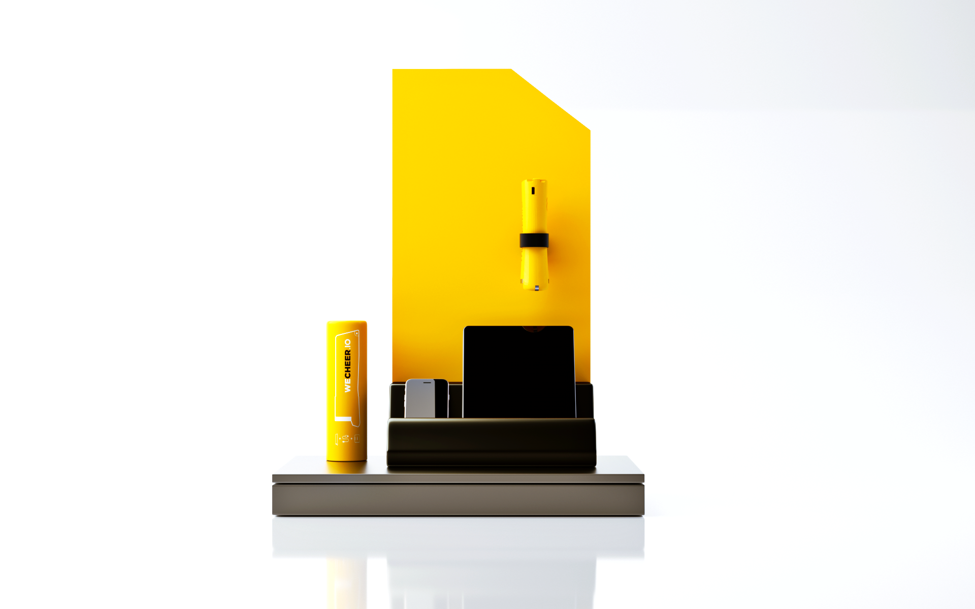
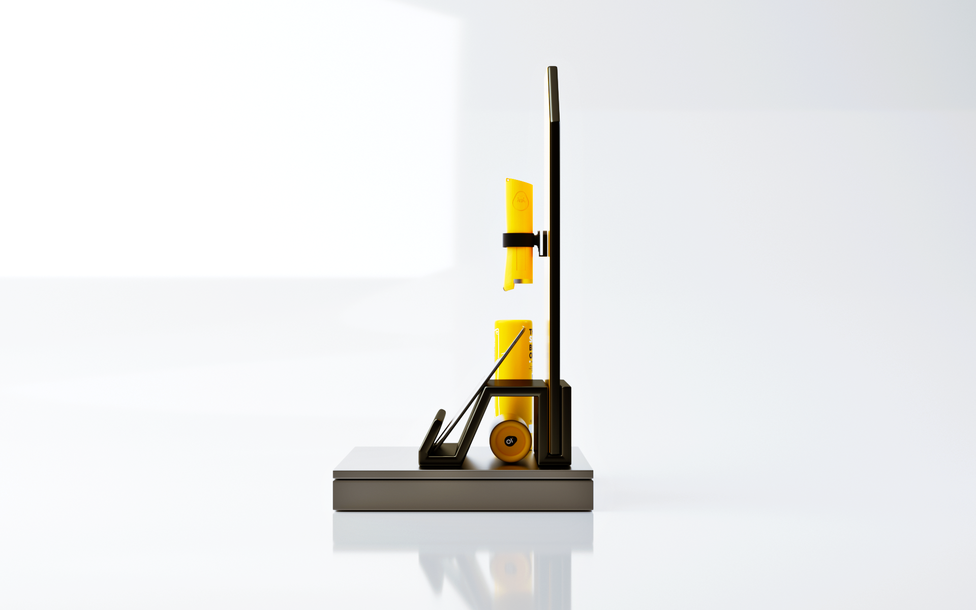
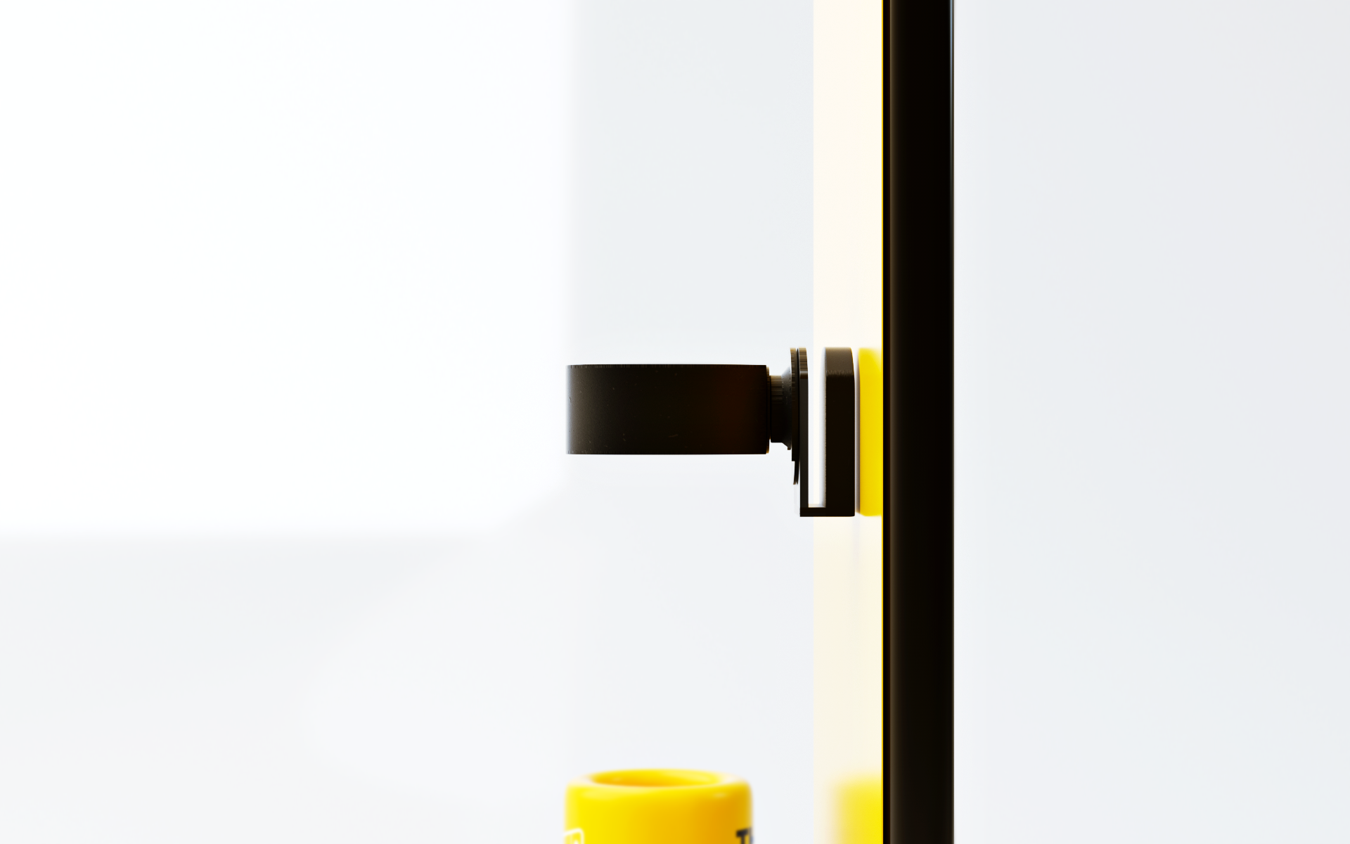
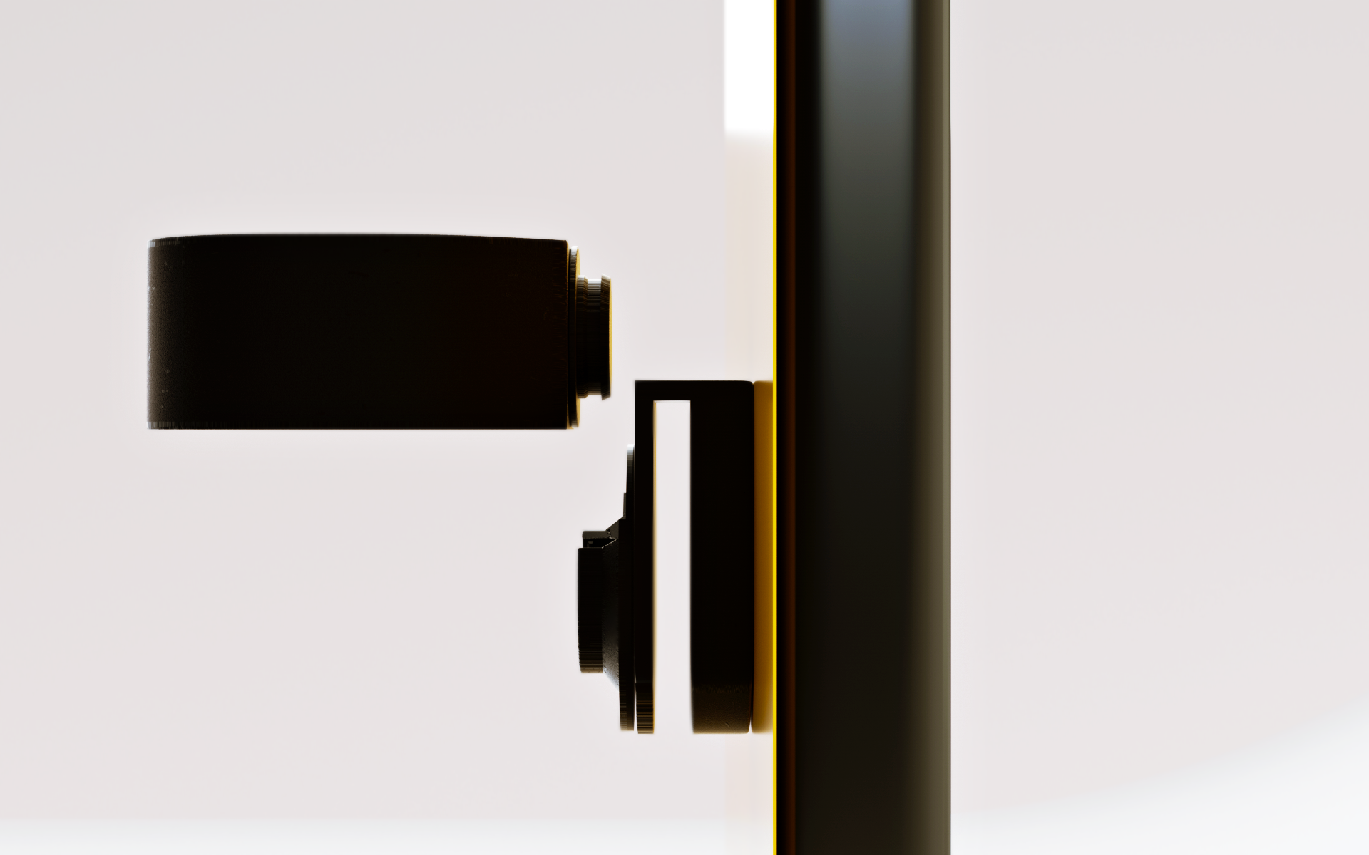
Stand case last design on 12th June, 2019
Finally, we agreed to produce this option. Simpler and cheaper than first one. That’s all for my very first 3D packaging project.
Thanks.
Tùng Đinh
Tùng Đinh