NUENMOTO / BRANDING
Client: NuenMoto
Project: Nuen Moto Branding
Scope of Work: Branding
Creative & Art Director: Tung Dinh
Account: Lisa Lia
Copywriter: LI IL
Designer: Sakkie Du
Marketer: Vu Luu

Back to the end of 2023, I had an opportunity to team up with Li il, Lisa Lia, Sakkie Du and Vu Luu to work on a branding project for the first E2W manufacturer business in Vietnam, NuenMoto.
According to their website, at NUEN MOTO, they are driven by a singular mission: to redefine the way people move, experience, and connect with their environment. Their journey began with a bold vision—to create electric motorcycles that transcend functionality and become a statement of design, innovation, and sustainability.
Vietnam characteristic, of course, plays the key role as the heart of their inspiration—a country rich with energy, creativity, and a rapidly evolving urban landscape. They see an opportunity to transform the streets with electric motorcycles that embody the modern Vietnamese spirit—daring, innovative, and deeply connected to both heritage and the future.
Identity Exploration Deck
We divided the project into 3 stages: Strategy, Design Applications Development and Workshops. Unfortunately, we were only able to finish the first stage.
First look of the concept model
For this project, to get inspiration, thanks to NuenMoto, they kindly sent us their 3D concept model to play with. That was an early stage of their product development but, a very big “BUT", we thought their first product was so well-done design. Therefore, I played around with their 3D model in Cinema4D and Octane, trying to render few videos for the team to be inspired.
NuenMoto unique bike frame and battery
To understand their product was an important task for us before working on their case. For a high-performance E2W, the bike frame and battery are the most important parts to investigate. NuenMoto did a great job on design their unique frame which represent the letter “N". We could only see the early version of look development of their battery holder. It was enough for us to understand their effort by their solid and industrial feeling design.
Beauty shot on frontal details of the bike
Then, I tried to create some close-up shots of the bike for the team to have a better idea of how the product looks like in order to understand the philosophy of minimalism design from NuenMoto design department.
Beauty shot on rear shock system of the bike
Updated model with battery holder

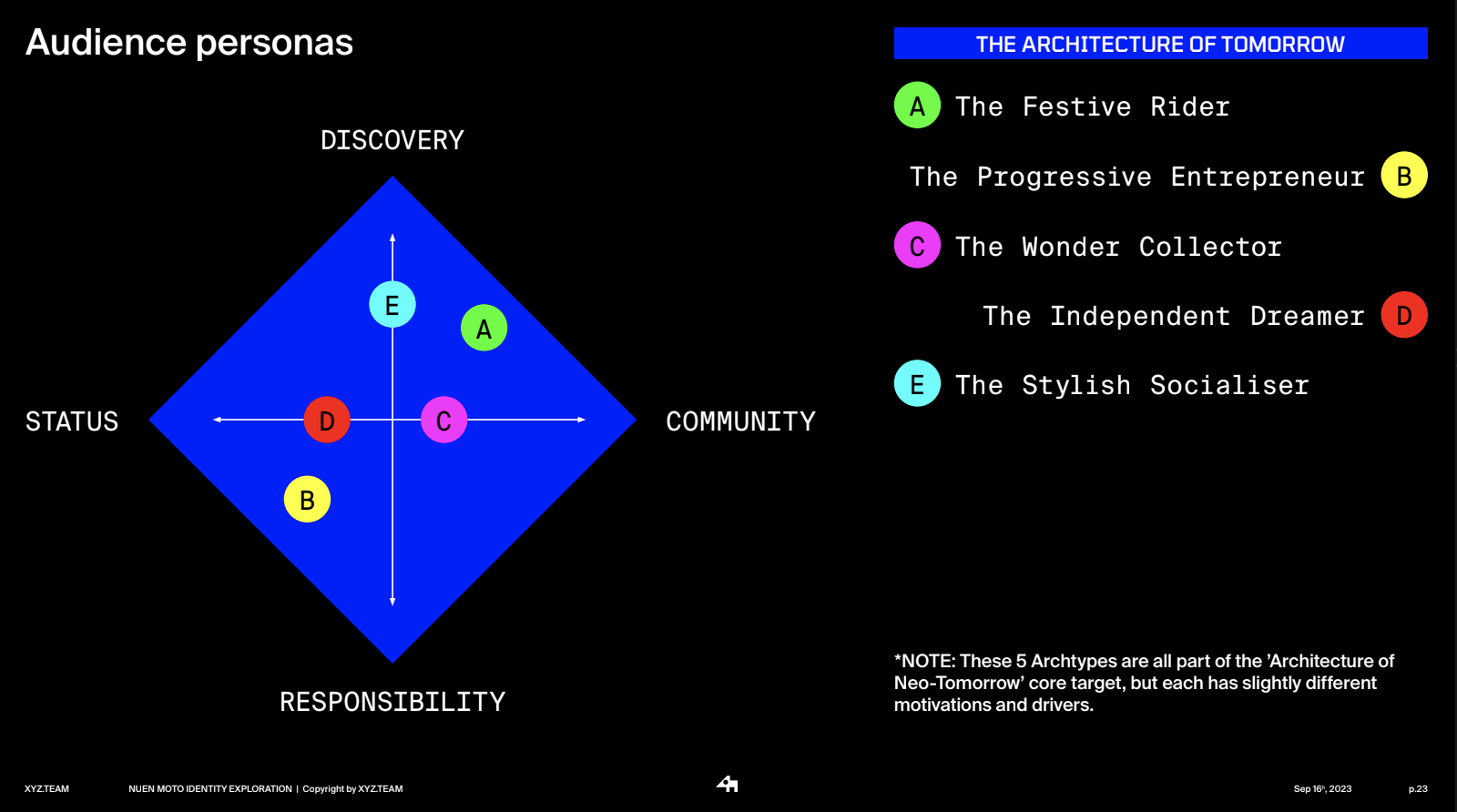
From considering the core target as a lens, we tried to create 5 different personas based on those 4 drivers above which are The Festive Rider, The Progressive Entrepreneur, The Wonder Collector, The Independent Dreamer and The Stylish Socialiser. We believe these personas would be the 05 important basements for communication campaign to break them even smallers, based on the characteristic of each campaign.


We even went further with the investigation on each personas based on key characteristics, their needs, their frustrations, their interests and their desired points (that related to NuenMoto service and product). The investigation was conducted both by research papers (I realized that the Indian Market shares quite similar insights to both global and Vietnam market) and small quantity interviews


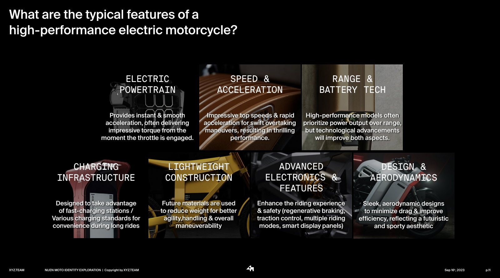
Looking at the 3D model was not definitely enough for us to understand the definition of high-performance E-Motorcycle. Also, we needed to understand the typical features of a so-call high-perfomance bike. From that thought, I started to research on those definitions for the team to know the basic concept of a vehicle like this one. For future usages, the typical features section can be easily considered a content column for the brand to communicate with their audiences.


Global EV development trends could also be considered as a potential resource for content development. Also, it played an important role in our process to define target audiences.

After that, it was a typical part of branding where we define brand values and their traits. Also, a pretty common technique “Perception Mapping" were used as a tool to keep the consistency of any communications from the brand to its audiences.


Brand world idea, usually is considered as the the umbrella idea of a brand. Everything that creating the brand, running the brand should be under this big umbrella. That’s the basic concept of this section. Everything should reflect 3 characteristics which are Electrifying, Disruptive and Minimal. I guess that is easy to understand for any users of the brand book. The slide was designed quickly, looting some nice photos in blue, a bit dark with cinematic feeling, only showing the silhouette of objects.


The brand vision and brand purpose were quite clear for both sides. Of course, for the whole company (now and future) to understand exactly what they mean is a difficult job. And guess what, this is branding, where stage 03 - the Workshops takes place. However, I guess branding job normally defined by design logo, color, typography and so on with those stationery, collateral, etc. For me, visual identity is not branding. You can’t basically go to that stage of visual identity without strategy stage. And only visual identity will note ensure the understanding of your brand (for both internal and external people)


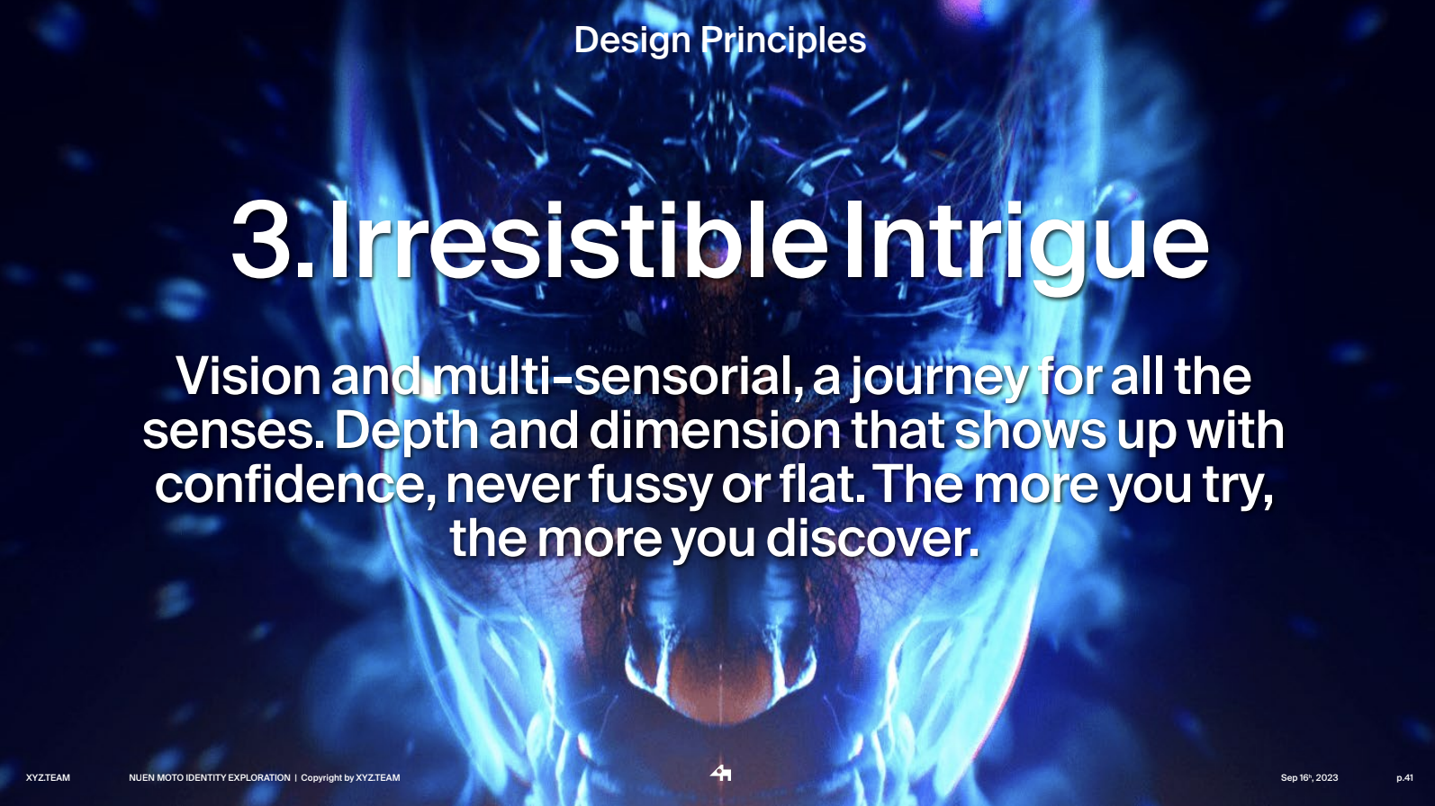
Every brand playbook will come with a Design Principles section where we created the foundation of design through principles. What does it mean actually? Is it jail or is it a basement for designers to play creatively, to be wild. Normally, it is considered too abstract to understand and too difficult to keep consistency since each people thinks different. But, that is creative. Do whatever you feel like, just be sure that your work reflect the design principles. For example, you can not design a nostalgic feeling for this brand, according to these principles.


To have a better presentation, easier to get the mood and art directions, in 2 nights, together with preparing the deck, I tried to finish 2 manifesto videos (from 3D setup to editing). Each video reflected different message and visual direction (still minimalism but in different way of voice).
Direction 2: Vibrant, younger, playful
Direction 1: Bold, classic, probaganda
At the end of the presentation, we also introduced the Brand Voice section where my friend Li iL took the role as our Copywriter. Also thanks to Sakkie Du for working so hard on designing logo for NuenMoto (although the stage 02 was suspended) and for understanding my branding working way. Thanks to Lisa Lia for her sweet communication with our clients. Last but not least, Vu Luu, for helping us to keep vibrant energy with the founders.
So fun this project I would say. A project that was a combination of my branding and 3D skills; creative direction and art direction skills.
Thanks.
Tùng Đinh